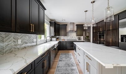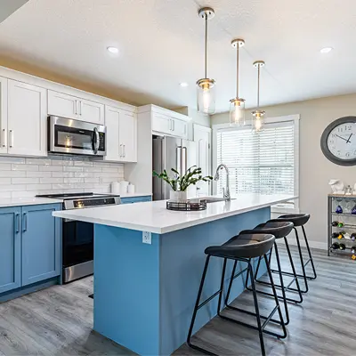
Design System

Every value below was measured, either off the rendered page at 1440px or out of the theme stylesheet. Where the two disagreed the render won, and the disagreements are named.

Colour

Accent--accent #f7921e
Accent alt--accent-alt #f8981d
Accent deep--accent-deep #de4e12
Link--link #cb4810
Espresso ink--ink-espresso #312e2b
UI ink--ink #3a3a3a
Button ink--ink-deep #292929
Body ink--body #736c64
Display ink--display-ink #8b827a
Warm band--band-warm #edebea
Cool band--band-cool #f3f3f3
Stone--stone #d6d2c4
Slate--slate #4f5c7e
Navy--navy #283f5d
Hero ground, under the photo--scrim #000000

Display ink is reserved for text at 38px and above, where 3.77 to 1 is a passing ratio for large text. Everything smaller uses the espresso ink at 13.49 to 1. Body ink stays on white, where it measures 5.17 to 1; on the warm band it hands off to the UI ink at 9.57 to 1.

Type

Display / Source Serif 4 / 400 / leading 1.12

Open Up the Possibilities

H2 / Source Serif 4 / 400 / leading 1.22

Trustpoints You Can Count On

H3 / Source Serif 4 / 400 / 24px

Kitchen Makeover Essentials

Body / Nunito Sans / 400 / 16px / leading 2

The two-em body leading is the source's own and the most distinctive typographic decision on the site. It is what lets a service page carry six hundred words of cabinetry detail without the column feeling dense, and it is worth protecting when this system is sprinkled over a client.

Fine print / Nunito Sans / 400 / 13px

The source sets fine print at 11px. This kit lifts it to 13px on the readable ink rather than the quiet one, because terms and disclaimers are copy people are expected to read.

Buttons

Three live variants, all 48px tall with a 3px border and a 35px horizontal pad, all inverting on hover to a white ground with the deep orange border and label. The filled amber button is the one execution change in the kit: the source sets a white label on it at 2.31 to 1, and this sets near-black at 6.29 to 1.

Cards and rails

Service card example

Service card

Square photo, heading, paragraph, arrow link. The homepage's main navigational block.

Review card

Quoted headline, review body and a first-name-plus-city attribution, on a white ground with the soft grey shadow.

Card anatomy
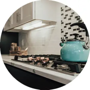
Trustpoint card example

Trustpoint card

Two-word promise.

Square photo over a name, a promise and a paragraph.

Radius 0 Border 3px on controls Shadow 0 3px 6px rgba(0,0,0,.16) Container 1280px Transition .15s linear
Assets

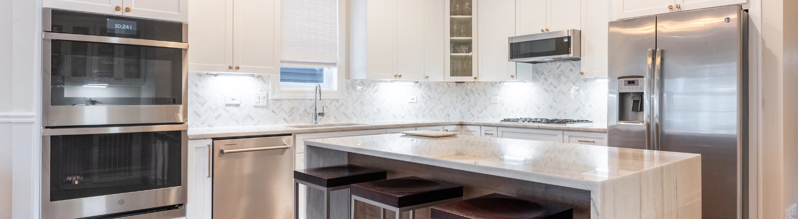
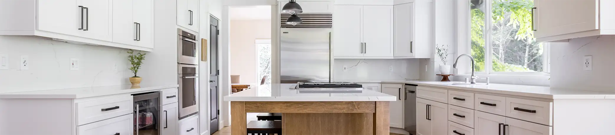
Homepage hero slide
hero-kitchen-01.webp
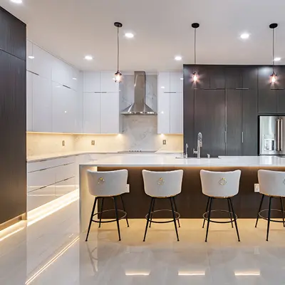
Second hero slide
hero-kitchen-02.webp
Interior page banner
subhero-kitchen-01.webp
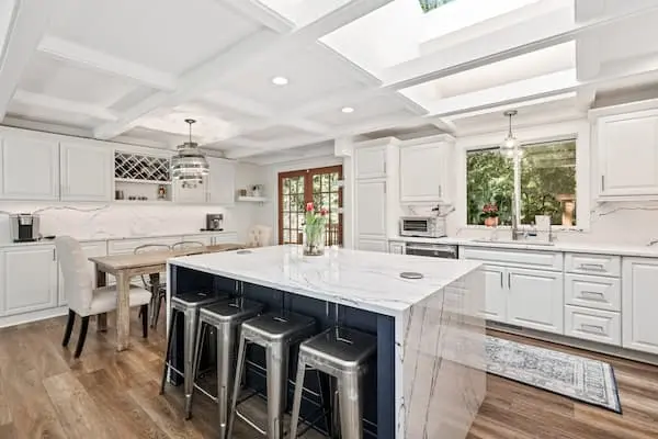
Refacing service card
service-card-refacing.webp
Custom cabinets service card
service-card-custom-cabinets.webp
Before image
beforeafter-01-before.webp
After image
beforeafter-01-after.webp
Trustpoint thumbnail
trustpoint-listen.webp
Financing module image
alt-module-financing.webp
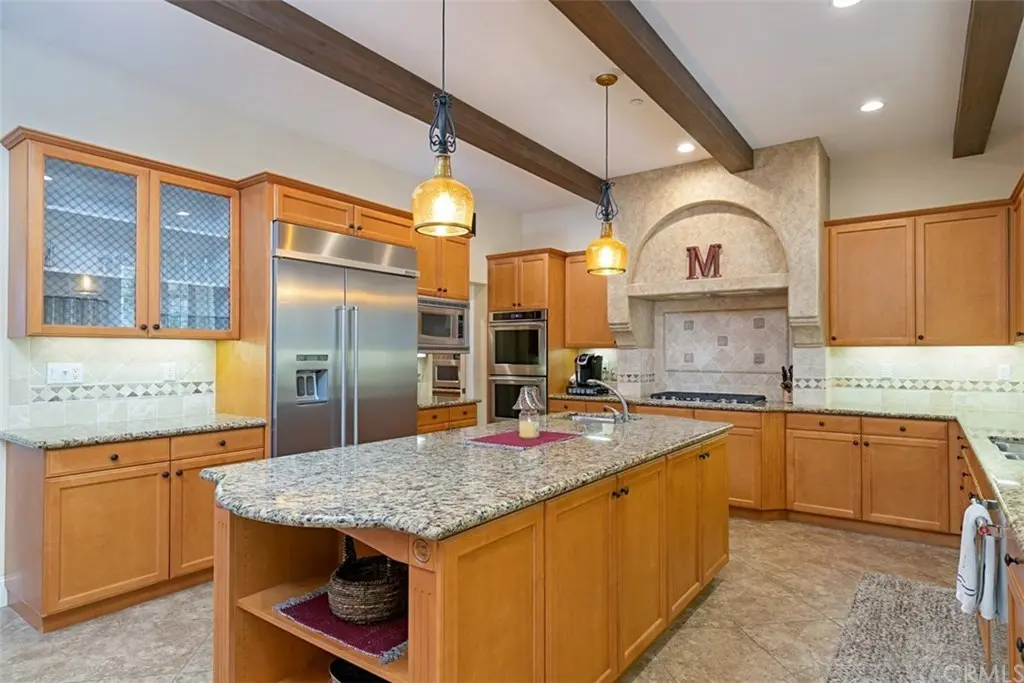
Service detail thumbnail
service-detail-refacing.jpg
Brand wordmark, orange
logo-source.svg

All ten photographs pass the baked-composite check: no brand hex holds one percent or more of the sampled pixels, so none of them is the brand device already flattened into a raster. The wordmark ships in two fills, the source orange and a paper variant derived for dark grounds; the source only covers the orange-on-light case.